OBJECTIVE
I was challenged to create branding and package mockups for Diology, a non-profit fighting for more accessible transgender healthcare.
MISSION
Privatized Healthcare has an uneven playing field for gender non-conforming individuals.
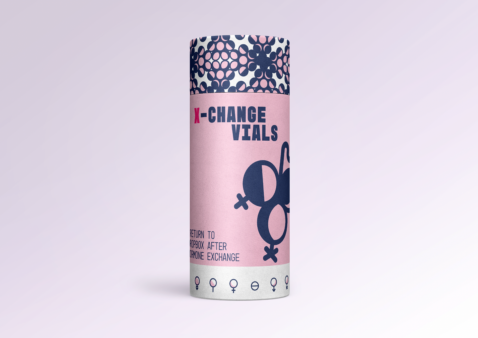
Diology is a discreet grassroots 'bank' aiming to increase accessibility for Gender-Affirming Care. Transgender individuals can swap their undesired clothing, makeup, hormones, body parts, and even chromosomes, in exchange for those desired from other donors.
VALUES
Judgment has no place here; united, we rise above hate!
We can all benefit from sharing leadership.
People over profit. No one turned away for lack of funds.
MY ROLE
Ideator, Graphic Designer, and Creator of Diology. Founder of the organization Prismatic Children, the nonprofit that Diology is based on.
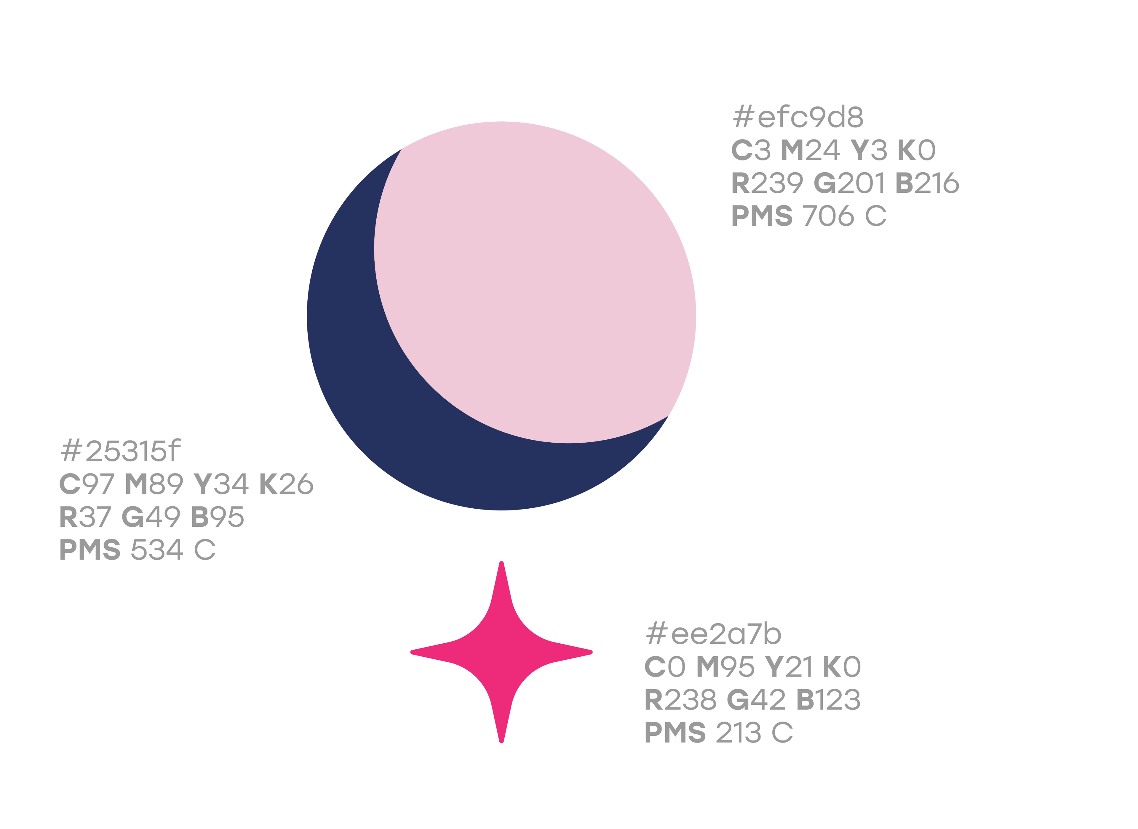
FINAL PALETTE
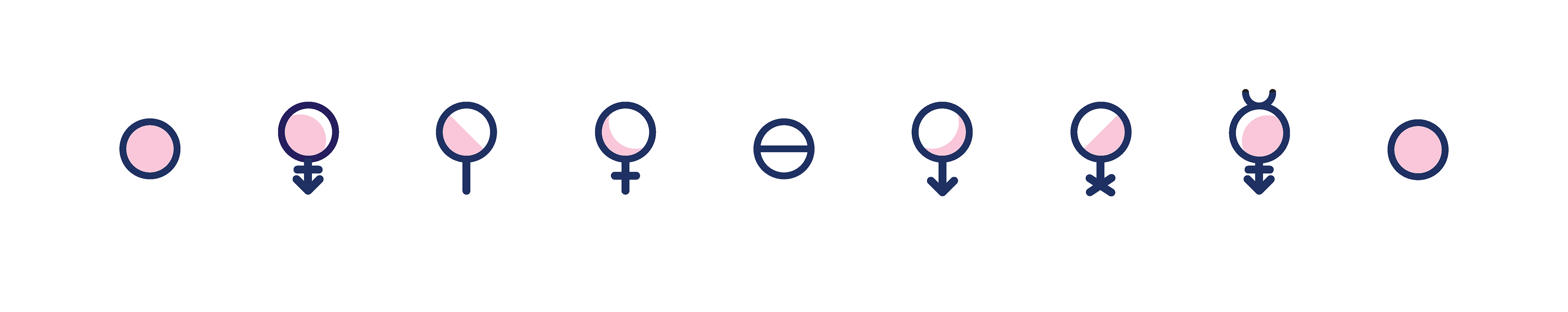
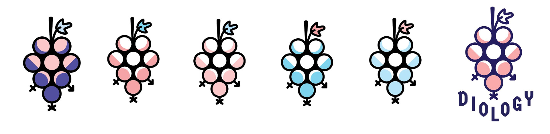
Diology's color palette light pink and deep, intense blue; the divine feminine, masculine, and androgyne. An ever-vibrant fuschia is used as an accent to guide the eye on packaging.
TYPOGRAPHY
Germania One sits androgynously balanced between past and present, professional and welcoming. It has a strong posture and low contrast of typical medical logotypes, but the uniqueness of the people it serves
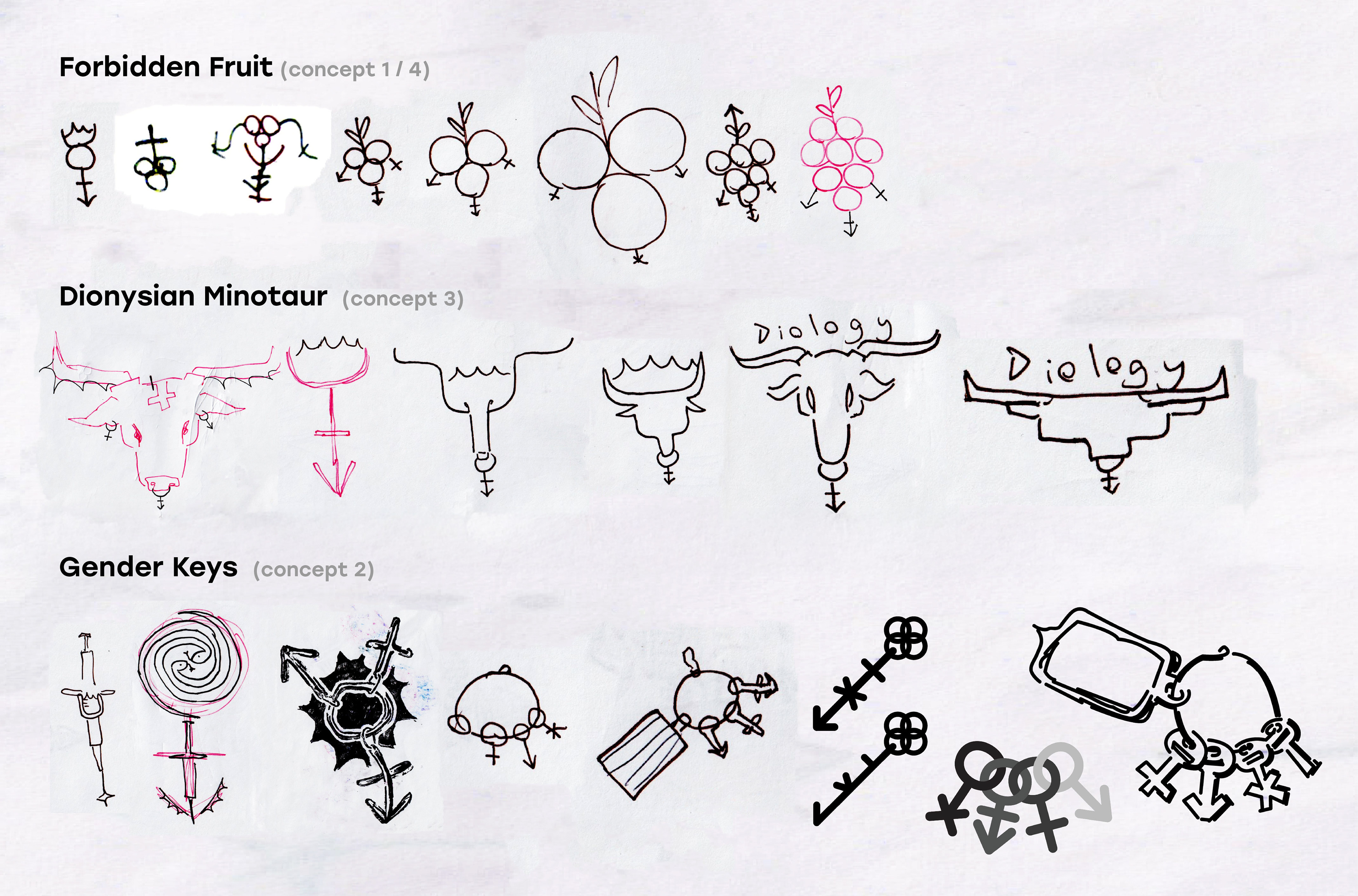
SKETCHES + IDEATION
.
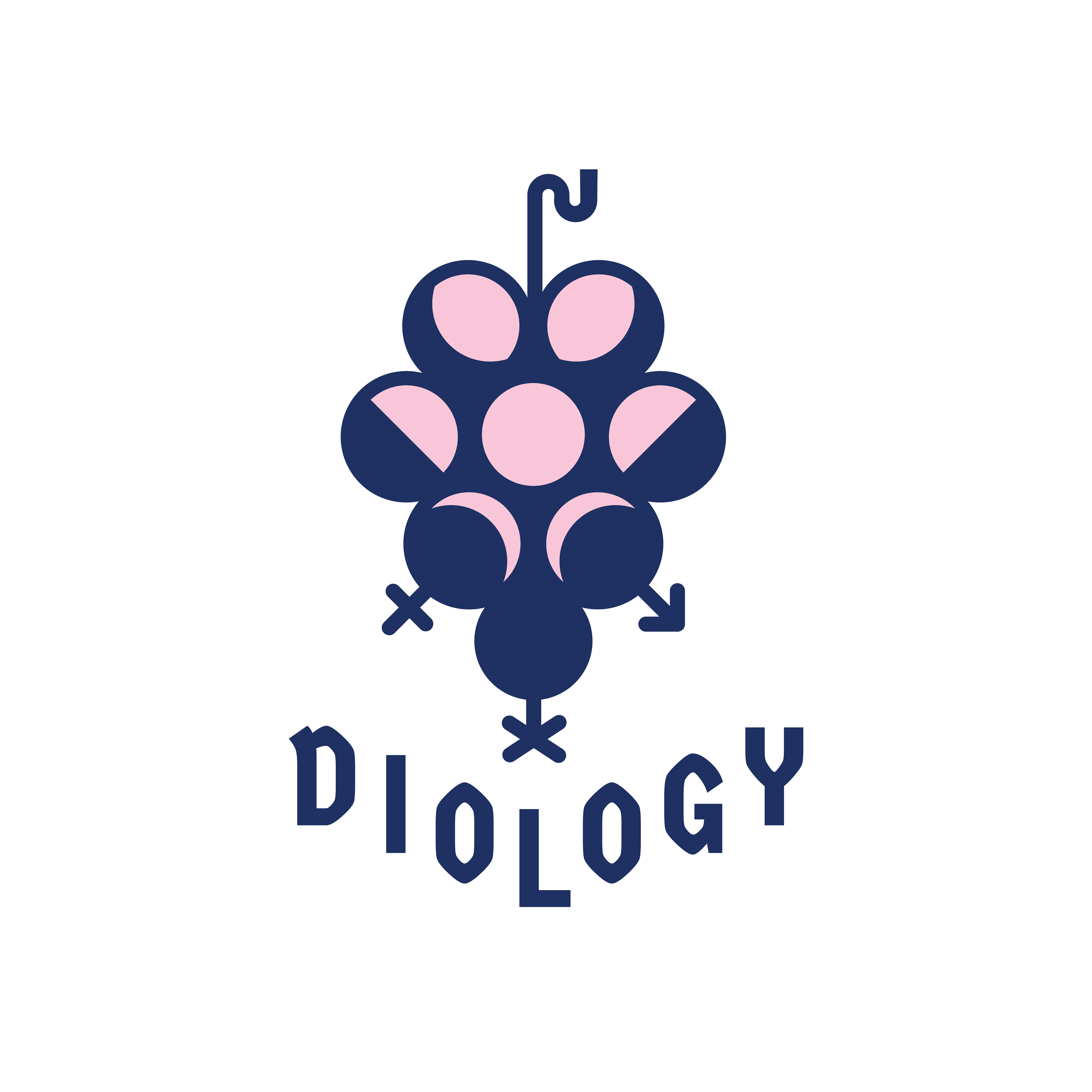
FINAL LOGO CONCEPT
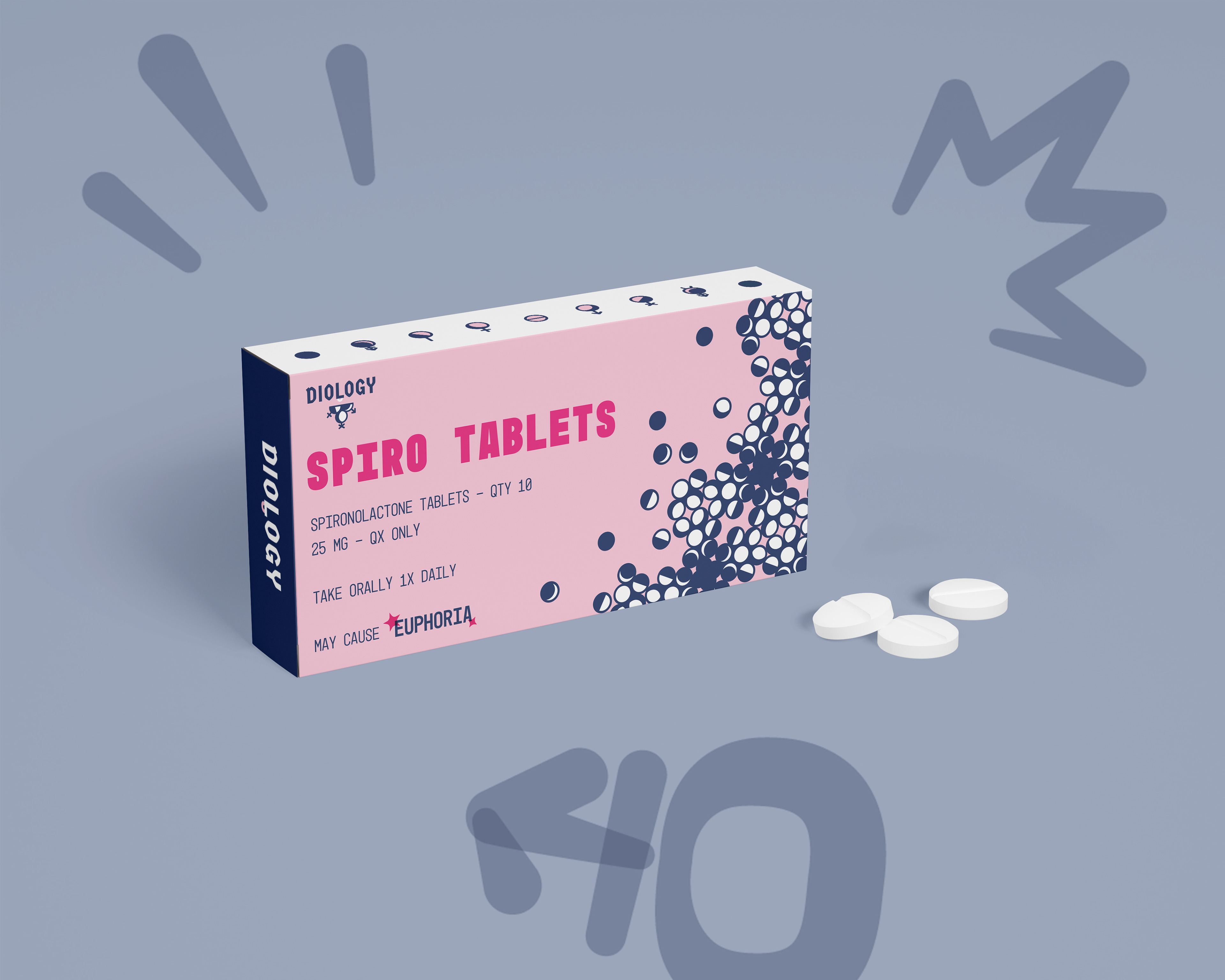
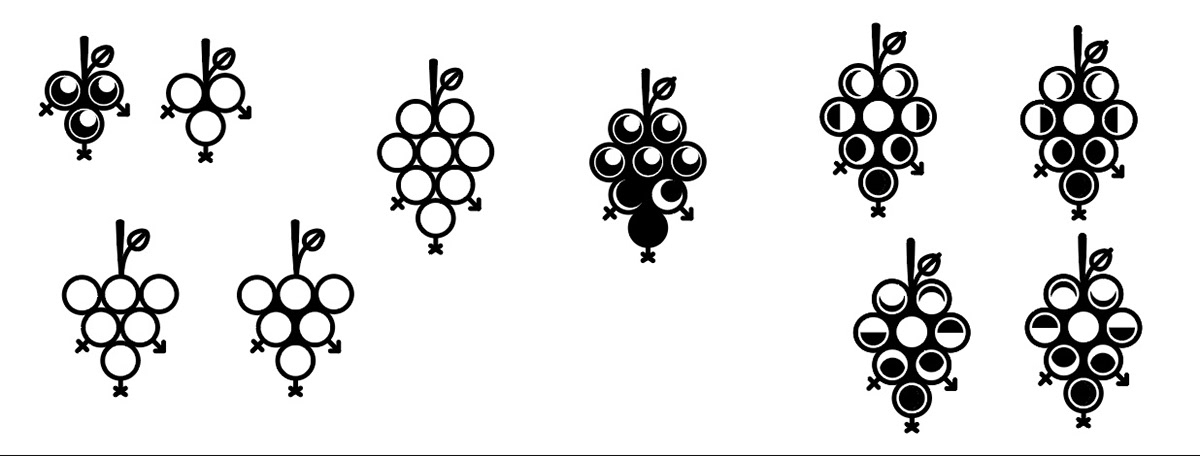
Dionysus is the God of wine, sex, and transsexuality. Diology proudly bears a bunch of grapes to represent him.
The contour and shading are created with the moon's 8 phases, representing transition and fluidity, as well as how the moon impacts one's hormones.
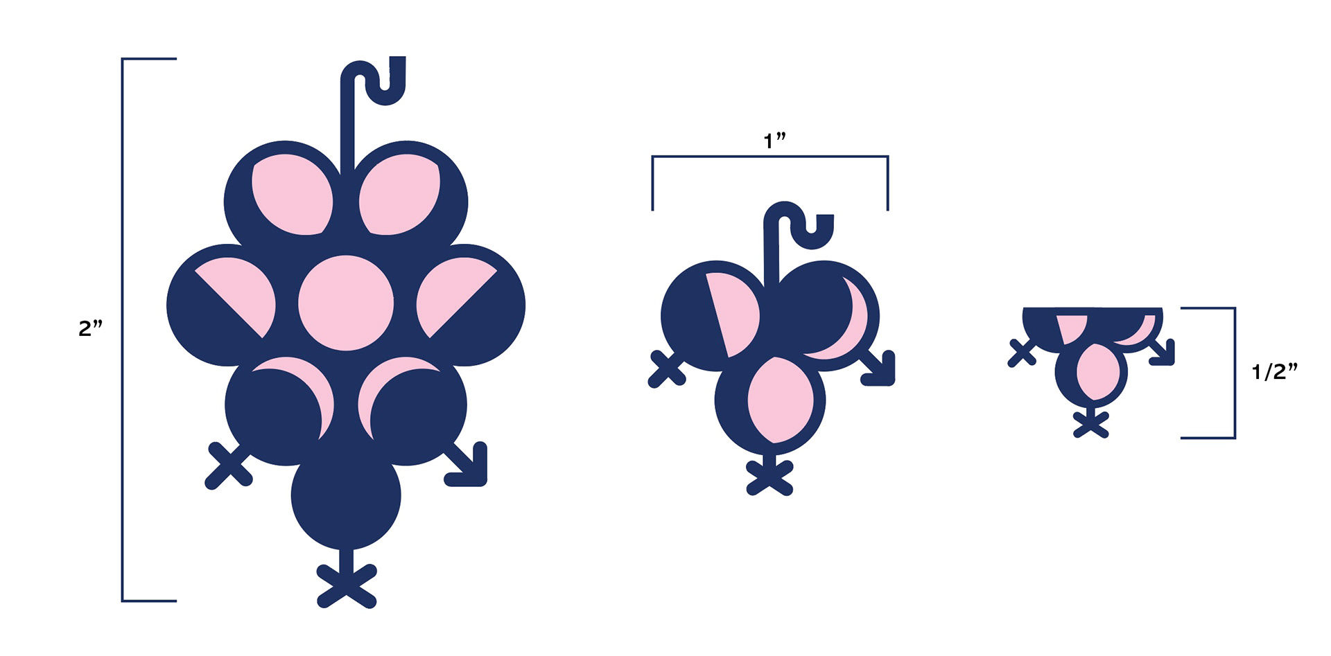
PACKAGE DESIGN
.